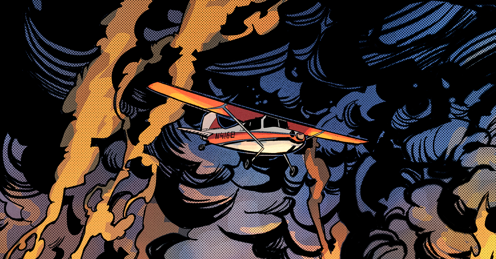
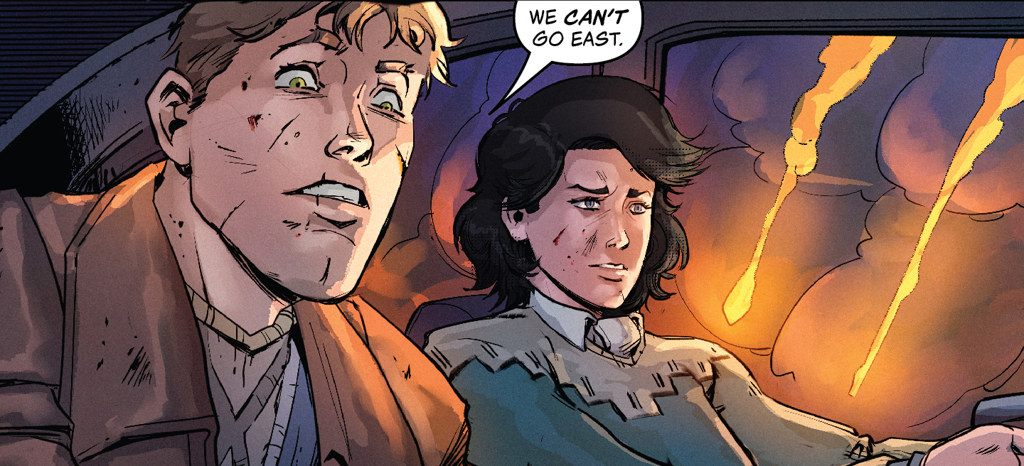
 I’ll be releasing the Calculating Stars chapter 3 comic in a couple of days, but first I wanted to drop the cover. Be sure to check out my previous blog on the challenges of adapting a novel chapter into a short comic.
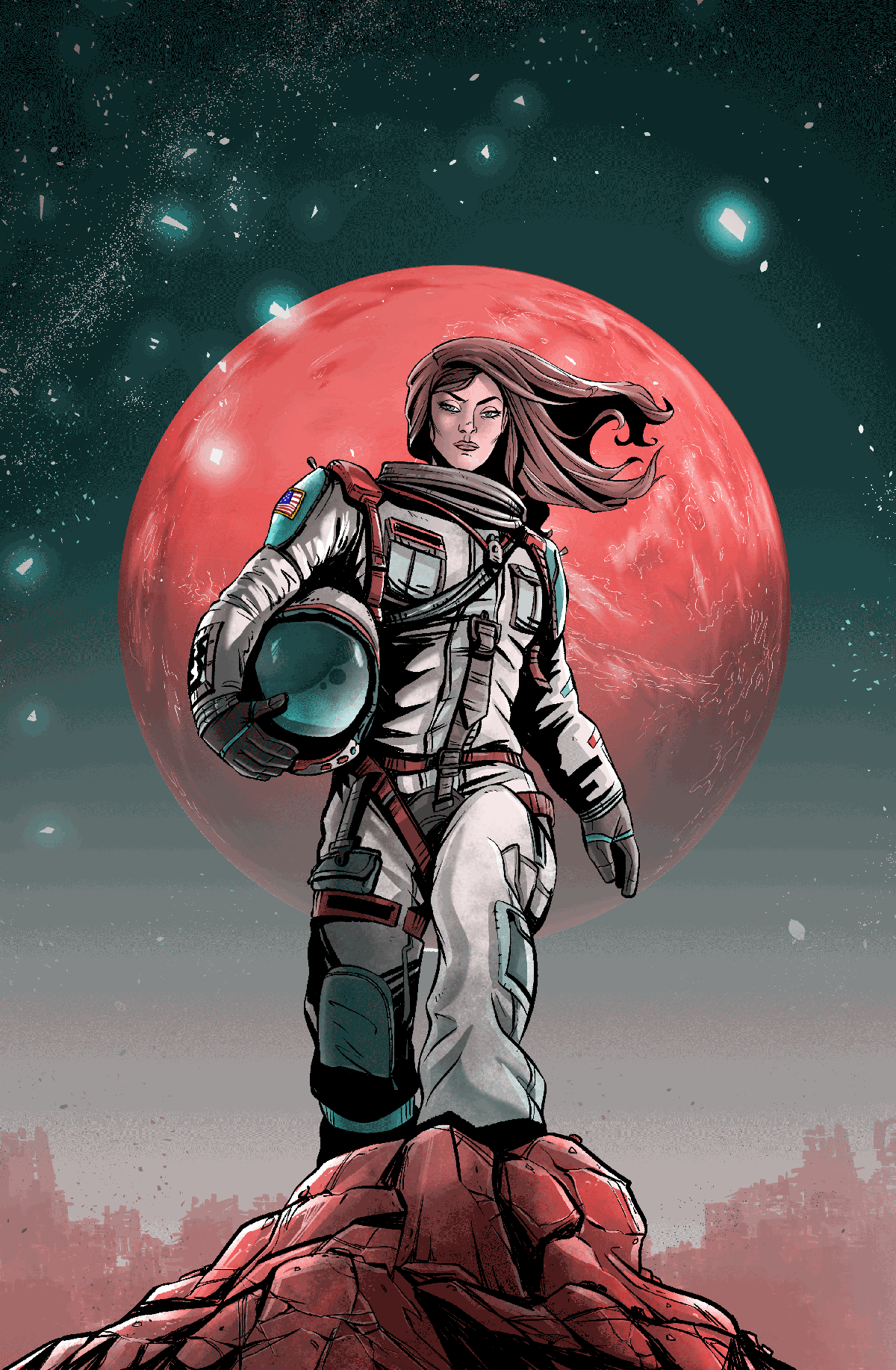
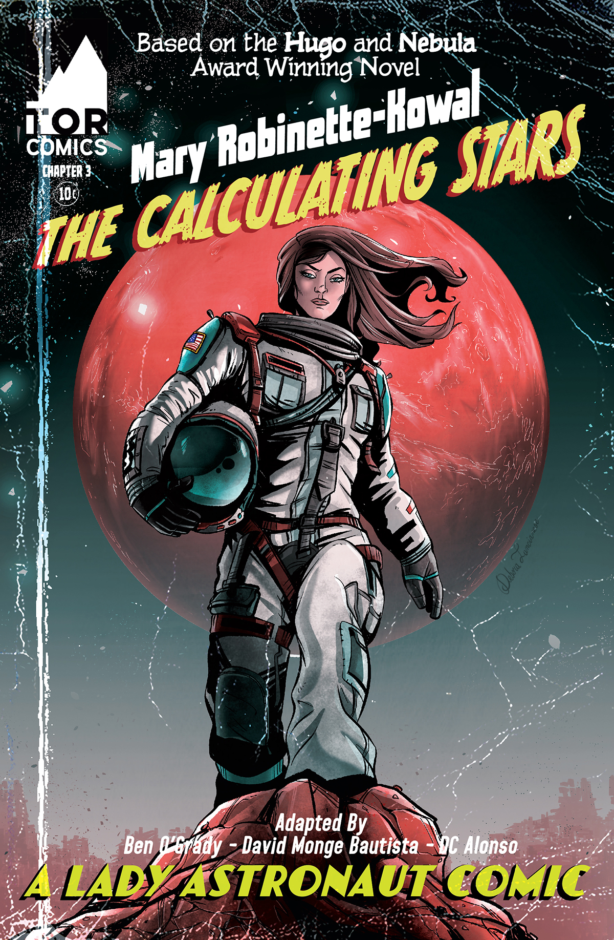
Since the story takes place in 1952, I wanted the cover and design to have a vintage, 1950’s comic book look. I hired Debora Lancianese, a super talented Italian comic artist, to make an image that included elements from later in the story and would be immediately recognizable to fans of the Mary Robinette Kowal’s novels.
I was lucky to get Debora even for just this one image. Her art is much in demand and can be seen in several on-going and forthcoming comics:
- The Lost Garden
- Explosion High
- Quicksand (coming soon on Kickstarter)
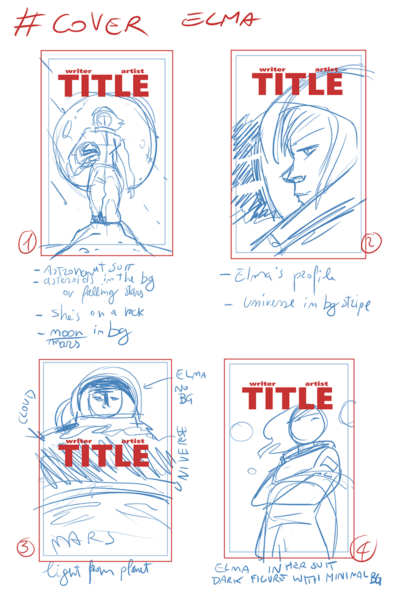
After working through several ideas via thumbnails and layouts, we settled on one hero type image.
I was blown away by the final image and thought it was going to look great as a cover. I like her take on the look of Elma York, the titular Lady Astronaut, and also how this is a classic hero shot you’d see in a pin-up or a splash page. Seriously, I could see this as the cover image to a trade paperback that collects all 12 issues of the Calculating Stars comic. With all that being said, it was a pleasure to work with Debby on this part of the project.
The next step was connecting with Rob Jones, a professional comic letterer and graphic artist. I explained my idea and provided these comic covers from the 1950’s as reference material. (Also, I ain’t gonna lie, I had recently read Strange Adventures #1, the new Tom King/Mitch Gerards/Doc Shaner series, and the cover has a similar vibe.)
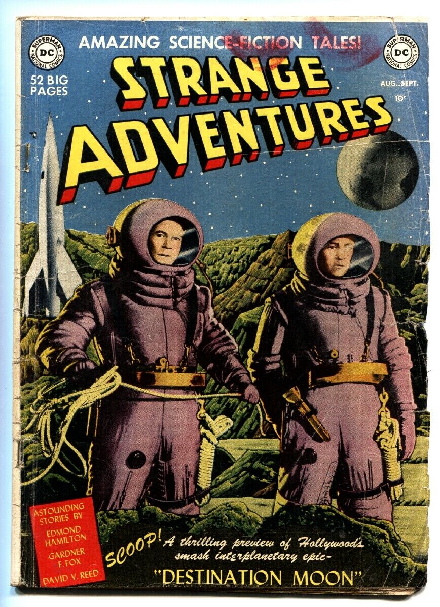
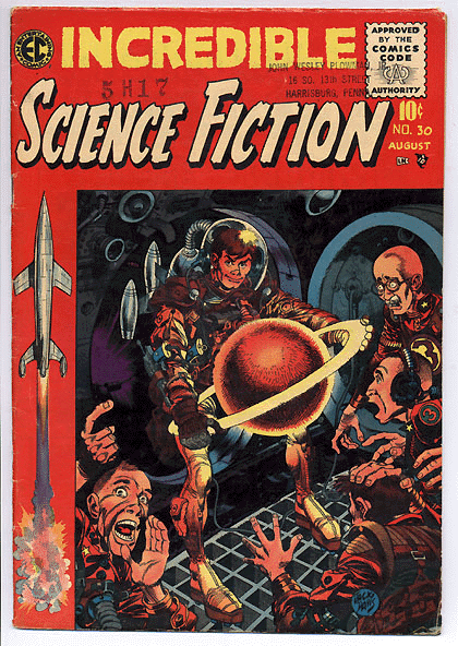
I love everything about the look of these covers, from the EC Comics artwork to the retro rocketships to the goofy sci-fi fonts. Most importantly, I wanted the texture and wear of the paper to be there, if possible, like it was really a 70-year old comic book. Retro is in, baby!
Rob ran with the idea and totally crushed it. Here is what he came up with. I especially love the fake Tor Comics logo and the 10¢ icon. (Does Tor, the publisher of the novels, have a comic imprint? I couldn’t find any evidence of this.) I think this cover looks so damn good, I want it printed…I just wish I could get it aged and crinkled like an ancient comic from the 50’s!
A couple of final thoughts. I have to emphasize how important good design and good lettering is take a comic to the next level. Lettering is something casual readers never think about, including me for a long time, but it’s incredibly important to get right or else it wrecks the reading experience. Lettering creates the audio and soundtrack in your brain and it also helps direct the eye across the page. Similarly, good design can be the difference between a reader picking up your book on the shelf or not. This project really hammered home how important the two disciplines are.
How do you like the cover? Let me know! I’ll be releasing the full comic in a few days.
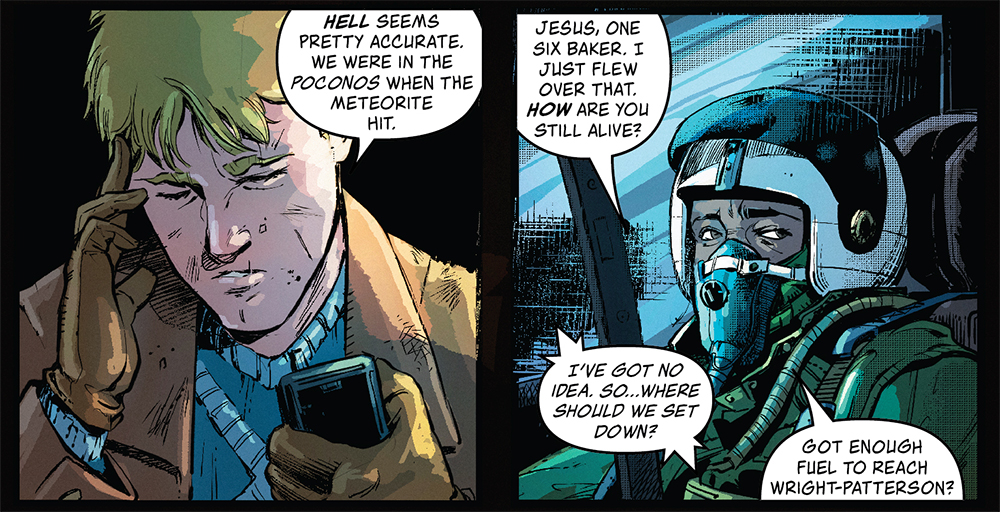
Cool Comics Corner
- The Many Deaths of Laila Starr (love Andrade’s artwork!)
- Star Trek: Year Five
- Ennead: The Rule of Nine
